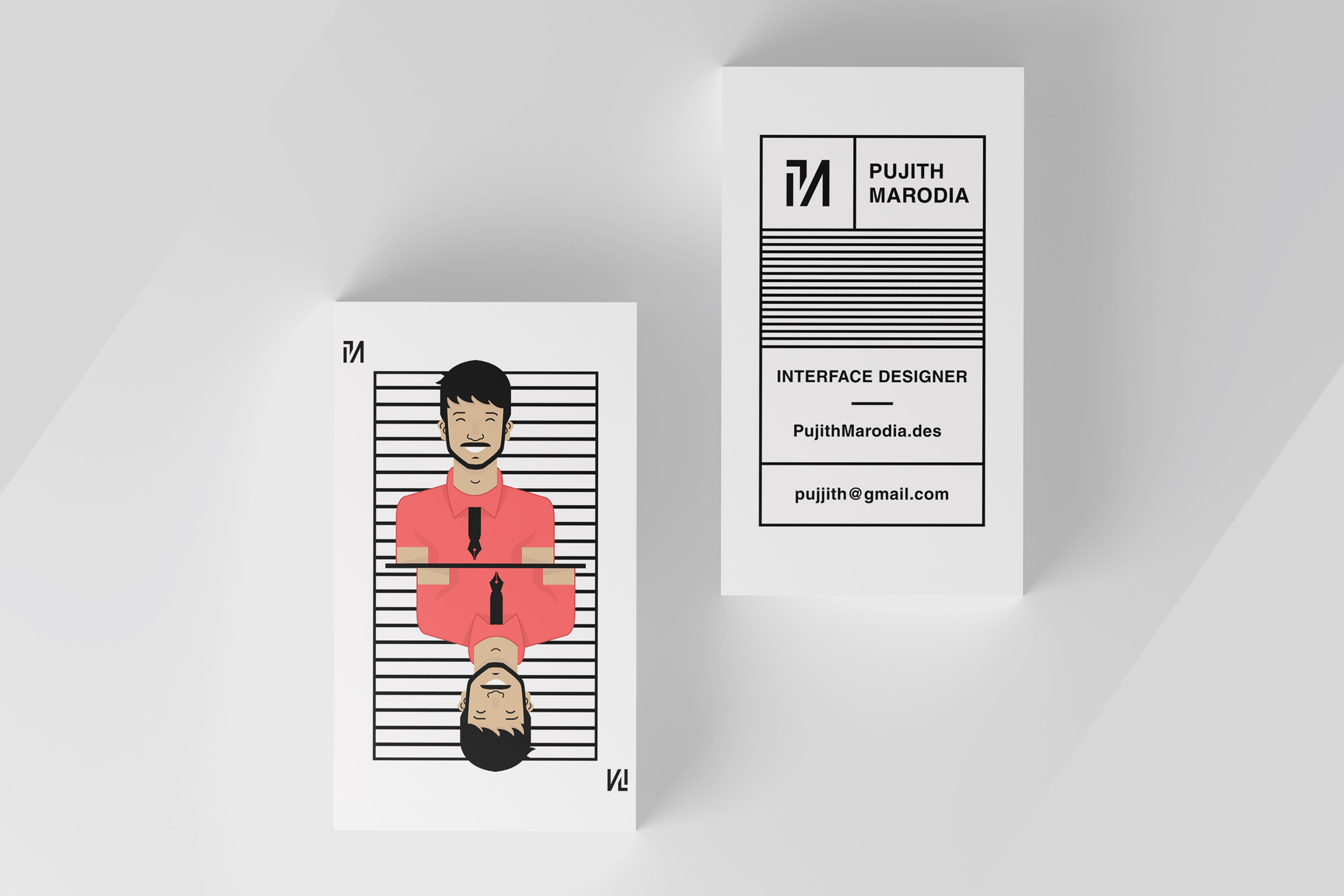
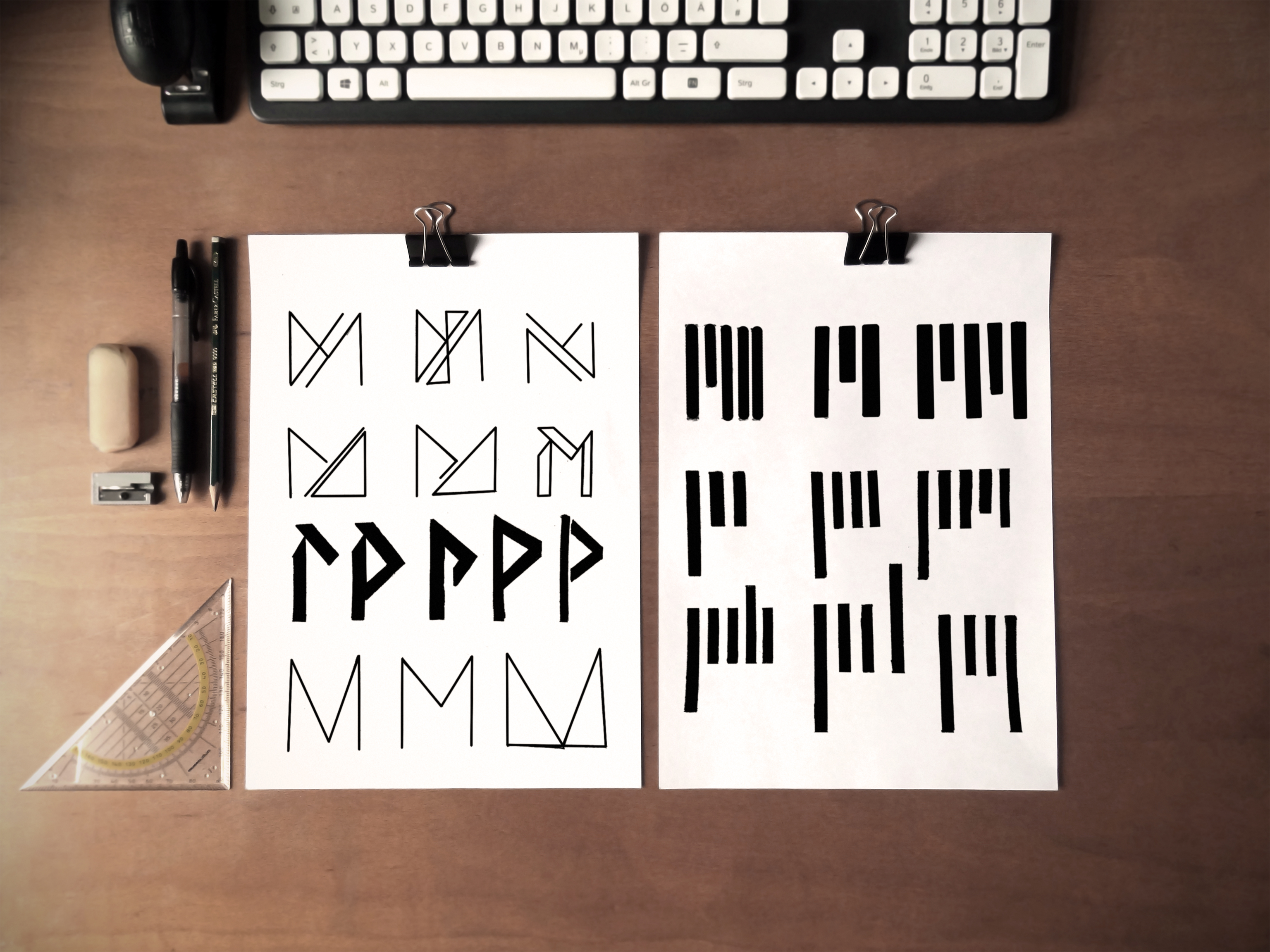
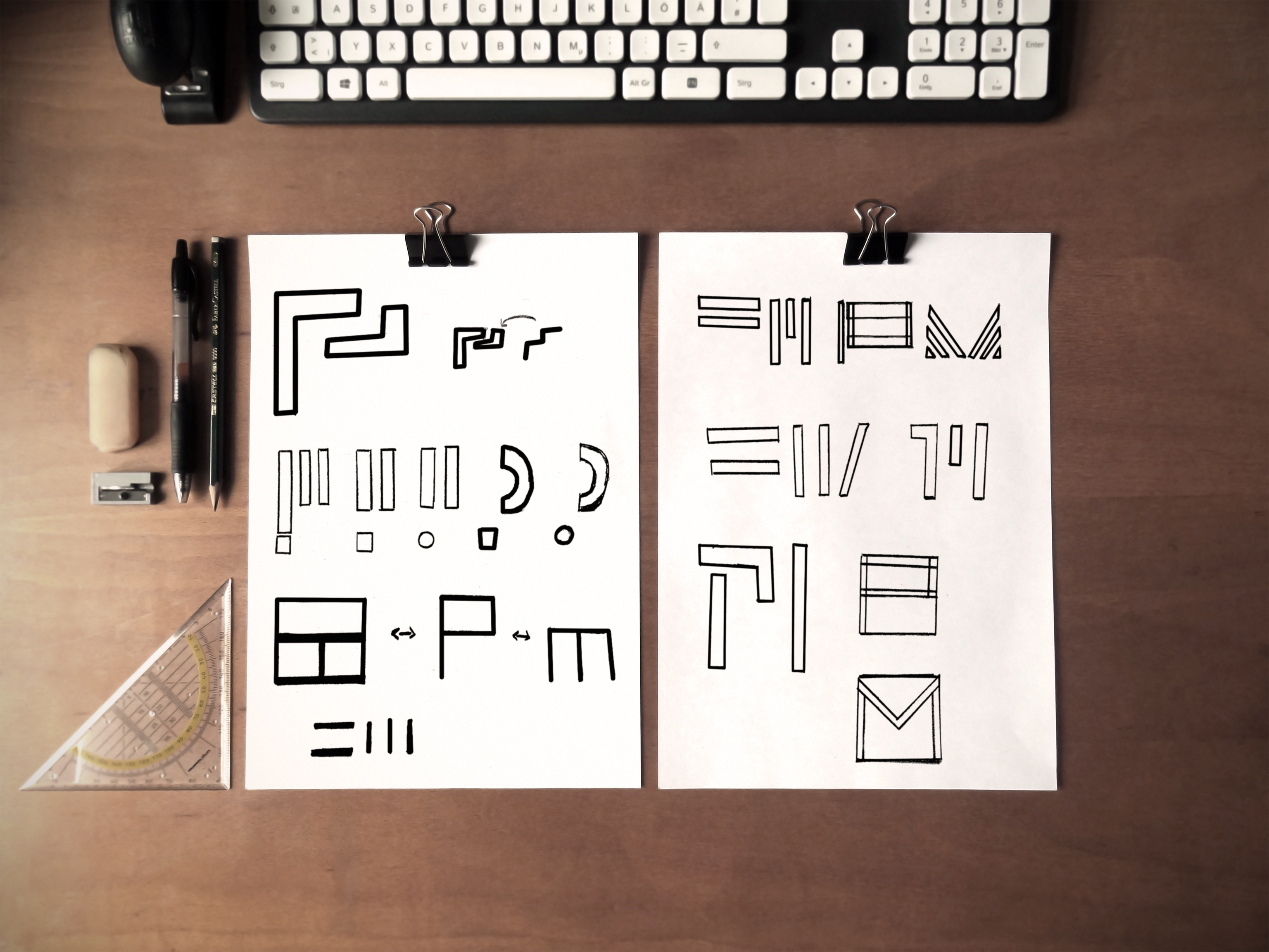
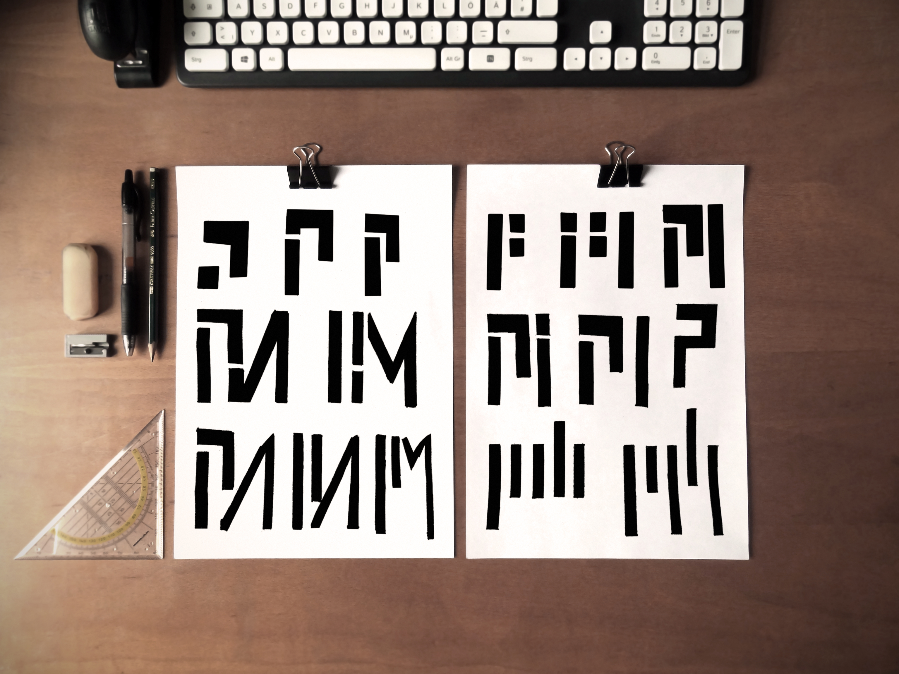
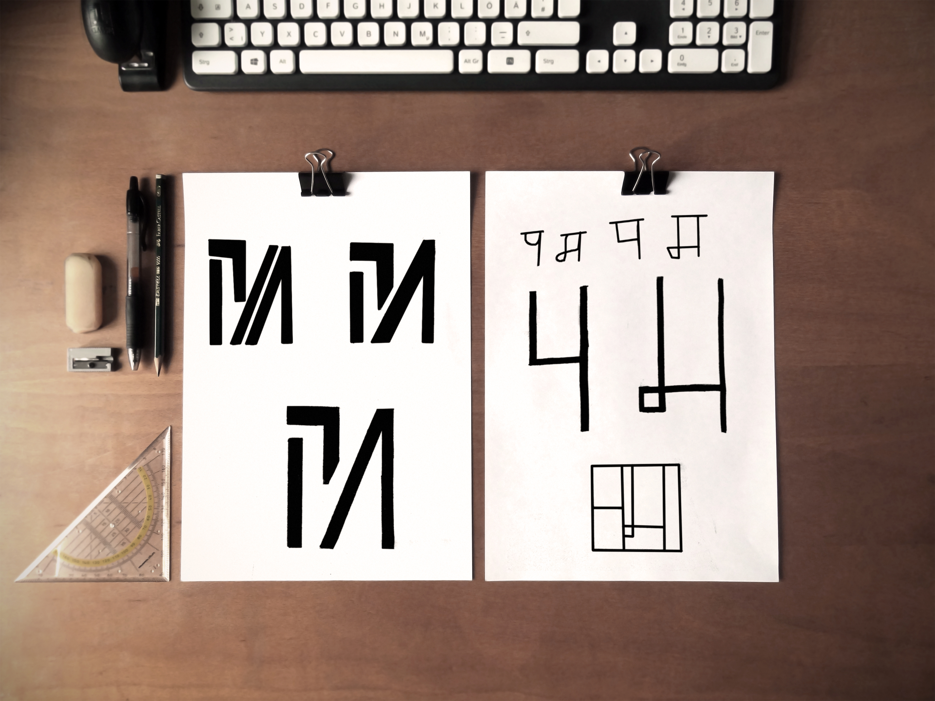
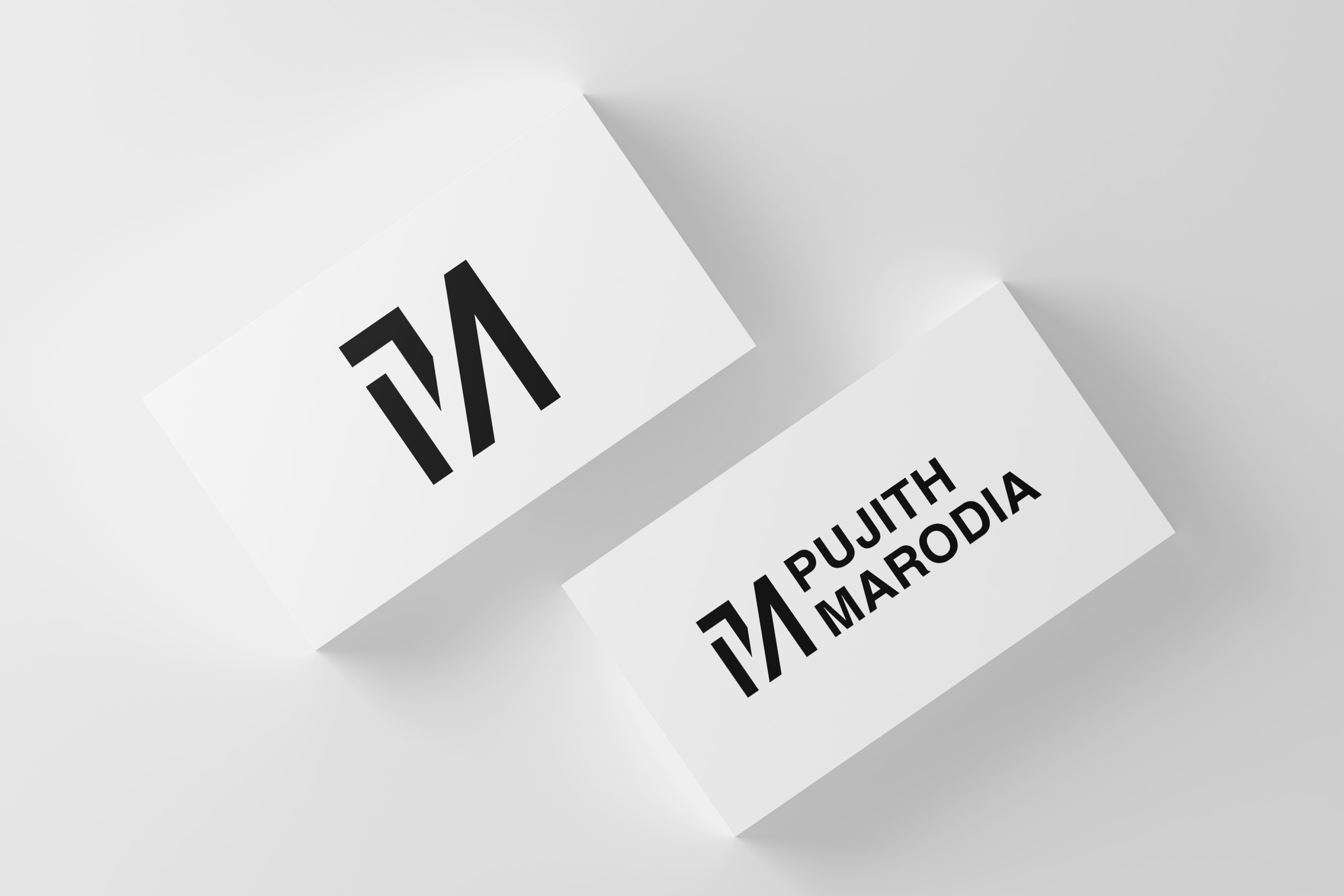
Monogram and Wordmark
This is my monogram and wordmark mocked up on some business cards. I'm extremely pleased with the result, it has the minimal aesthetic I was going for. One area that can be improved is definitely the clarity of the P. I'm going to continue working on this monogram to improve this aspect of the design.